Most people work out their label design first and their quantity second. That order causes problems. A personalised alcohol bottle made as a single gift needs different thinking from a run of a hundred going out to corporate clients, and the gap between those two jobs is wider than it looks. Quantity is not just a number you type at checkout. It quietly decides your budget per unit, your tolerance for mistakes, and how much detail survives on the finished bottle.
Here is why that matters. When you order one personalised alcohol bottle label, every cent of your artwork time sits on that single item. When you order a hundred, that same design cost spreads thin, and suddenly you can justify things you could not before. The design brief changes. So does the risk if you get something wrong.
Single Bottle Label Design: Personal, Specific, Forgiving
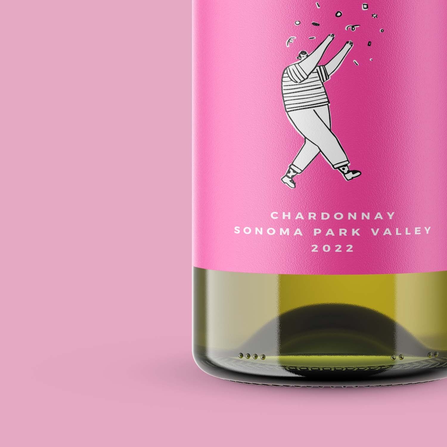
One bottle is a gift. Someone will hold it, read it closely, and probably photograph it.
That closeness changes what works. Small text is fine because nobody is scanning it from two metres away. An inside joke lands because you know the reader. A slightly odd colour choice reads as intentional rather than sloppy.
You also get room to be specific. A date, a name, a line that only two people understand. None of that scales, and it does not need to.
The forgiving part is the mistake cost. If the alignment sits two millimetres off, you reprint one label. Annoying, not expensive.
Bulk Alcohol Label Printing: Consistency Beats Cleverness
Now flip it. A hundred bottles heading to clients or a wedding table work differently.
People see them in a group. Ten bottles lined up on a trestle table create a pattern, and any inconsistency shows immediately. Uneven placement that nobody notices on one bottle becomes obvious across a row.
Let’s break it down into what changes:
- Text length. Names of different lengths need a layout that holds up whether the word is three letters or eleven.
- Placement tolerance. Hand application varies. Design with a margin so slight differences do not read as errors.
- Colour discipline. One accent colour repeated across a hundred bottles looks deliberate. Three colours look accidental.
- Detail level. Fine linework that reads beautifully up close can turn muddy when the eye takes in the whole set.
Mistakes cost more here too. A typo on one bottle is a story. A typo on a hundred is a reprint and a difficult conversation.
Cost Per Label Changes What You Can Justify
Something worth sitting with. The per-unit price drops as quantity rises, which most people know, but the design consequence gets missed.
At one bottle, spending three hours on custom artwork feels absurd. At a hundred, that same three hours costs almost nothing per bottle. You can afford proper typography, a considered layout, maybe a shape that follows the bottle curve.
This is where a lot of people leave value on the table. They design a hundred labels with the same effort they would give one, then wonder why the result looks thin.
Choosing Label Material for Bottles That Get Wet
Bottles sweat. They sit in ice buckets, come out of fridges, and get handled with damp hands.
Synthetic stock handles moisture in a way paper does not. For a gin bottle destined for a party or a bottle of prosecco going into an esky, that difference decides whether the label survives the night or peels at the corner by nine o’clock.
Polypropylene works well for indoor use like this. Beverage and cosmetic products are exactly where it earns its place. Worth knowing that it is not built for outdoor exposure, so anything living permanently outside needs a different conversation.
For a single keepsake bottle that will sit on a shelf, uncoated paper stock is fine and often looks better. Match the material to the life the bottle will actually have.
See also: Possum Removal Northern Beaches – Licensed & Humane Wildlife Control Experts
Artwork Setup Is Where Small Orders and Large Orders Really Split
This part surprises people.
Setting up artwork properly takes roughly the same time whether you print one label or two hundred. Correct sizing, safe margins, decent resolution, colour in the right mode. That work does not scale with quantity.
So for one bottle, keep the artwork simple and accept it. For a hundred, invest in getting the file right, because the payoff multiplies.
Ask yourself: how many bottles would make it worth doing this properly? The answer is usually lower than people assume.
Where This Leaves You
Decide the quantity before you open the design file. That single sequence change improves most of what follows.
For one bottle, be personal and specific. Keep the artwork simple, spend your effort on the message rather than the production.
For a hundred, design for the group. Test the longest and shortest names, pick a material that suits the setting, and get the file right before you commit.
The bottles look different because the jobs are different. Treating them the same is the mistake worth avoiding.